The Town of Sidney has been working with community members and local graphic design company, FOE Creative, to update our current logo.
While the current logo has served us well, it presents accessibility challenges in terms of legibility: the script font is difficult to read and the light aqua-coloured tagline blends into the white background.
Following two public surveys to help determine preferred imagery and design, Council approved a new logo on September 11th.
This design will be incorporated into advertisements, posters, and other Town communications products this fall. Changing the Town of Sidney’s corporate logo will not affect the unique welcome signs in Sidney, nor our “Sidney by the Sea” tagline.
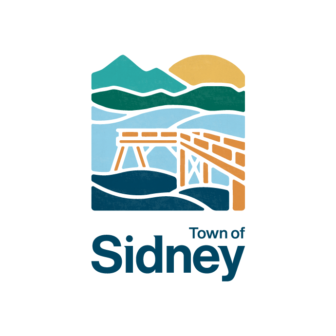
New Corporate Logo (to be rolled out in Fall 2023)
Sidney’s new corporate logo uses an illustrative style that is both modern and rooted in Sidney’s coastal heritage. It features the Bevan Fishing Pier with the Salish Sea, Gulf Islands, Mount Baker, and the rising sun layered in the background. This design uses the imagery that was most popular with community members in community surveys.
For many, the Pier is emblematic of the connectedness Sidney community members feel to the ocean, offering a free and accessible way to travel 150m out onto the water. Construction of the Pier began in 1996 as a community-led initiative, funded through donations, grants, and Town contributions.
There are three variations below, which will be available for different contexts.


Questions?
For more information, please contact admin@sidney.ca.